Tuesday, June 15, 2010

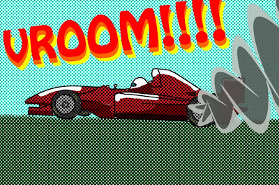
Assignment #9 Roy Lichtenstein style


For assignment nine we had to create a Lichtenstein style image from one of our own photos. I chose an image of an open wheel race car, knowing that the reduction of detail would reduce the movement but the smoke and text would bring back some of the energy that was lost. I gained a lot of experience working with the pen tool for the outlines and smoke.


Assignment #8 Photo Retouch and Cezanne style image


Assignment eight was a two part assignment. For the first part were to retouch a photo, removing blemishes, pimples, wrinkles and other unwanted imperfections. I thought this part of the assignment was very practical and has many other applications to other images, even those not of people, like removing image sensor dust, or flare.

For the second part of the assignment we were to make an image with a Cezanne painting-style incorporated into it. The characteristic blue lines and shadows really change the mood and feeling of the image, and can take an otherwise boring and bland image and make it more interesting. I liked the effect this assignment created.


Assignment #7 Seurat edit


Assignment seven was to digitally replicate a Seurat style look into one of our own photographs. I like the look that is achieved, and although I did mine in black and white for the assignment I think the effect works really well with a simple color image.


Assignment #6 Cut Paper Montages


For the sixth assignment we had to create cartoon-like cut paper montages. It really helped understand layers in photoshop as I had to be careful about what part of the image was above other parts, for the glasses, eyes and hair for example. We also had to manipulate a font to look metallic and add it to the photo.


Assignment #5 Outline and Fill


The fifth assignment was to take a photo and change it into an outline drawing. I chose to use different textures for the car and background to help distinguish the two. Unfortunately the motion captured in the original photo has been lost from the texture fill, and the result is a very static looking car.


Assignment #4 Line Art Hatching


The fourth assignment was a lot of fun turning a normal photo into a hatching/crosshatching style of drawing. I enjoyed this assignment a lot and feel that the style can used in other versatile ways.


Assignment #3 Graffiti Stencil


The third assignment was to create a graffiti stencil and superimpose it onto another image. I chose to use my own images to work around with the difficulty in getting the two images to work together. The brushes and blurring techniques help to blend the stencil into the real photo.


Assignment #2 iPod ad


Our second assignment was to recreate an iPod ad using our own image to silhouette. I'm like the simplicity of the silhouette in reducing a subject, and adding the shadow creates a sense of depth and realism to otherwise simple and flat image.


Assignment #1 Ransom Note


Our first assignment was to create a ransom note, with the words appearing to be cut out of random texts and glued on a piece of paper that we scanned and manipulated ourselves. It was cool to learn how to change font colors and scan our own textures.